Motorway Signs
This page aims to give a non-technical guide to the different types of signs used to advise drivers of an upcoming motorway service area. There is a similar page for A-road Signs.
Mainline Signs
Mileage Sign


The first sign is officially known as Diagram 2918 and it simply lists the distance to the next service area. Space permitting, it should be placed after every junction (after the route confirmatory sign), except at the last junction before a service area. The idea was to encourage people who can't wait that long to leave at the next exit.
For a while it used to be that these signs would include the service area after the next one, but this was seen as unnecessary - perhaps too many people were playing 'petrol station roulette'. The original wording given for these signs was "Next Services x miles".
This sign doesn't take into account any rest areas. The sign can also be changed to say 'No services on motorway', this becomes Diagram 2918.1, and similarly Diagram 2330 allows for the more specific 'No services on M1'.
All of the distances should be to the exit, not the services themselves, as if the services are a few miles from the motorway drivers might see the signs and presume that they don't need to leave yet.
The signs are funded and maintained by Highways England.
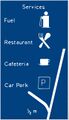
List Sign

Current documentation calls this the Remote Distance Signage (RDS). If there is a need for more information than the first sign provides, Diagram 2917 can be used. It's always displayed prior to each service area as well. It was based on signs used in Germany in the 1950s. Before a rest area, a sign in its place saying 'Rest Area 1m' should be used.
This sign differs because it lists the distance to several services, includes the operators (between 1982 and 2012 only), and can handle services on several roads which is important near motorway junctions or in areas with few services. On the original drawings, space was left for a star-rating system which was never introduced, despite a reminder being issued in 2008. Only the next or next-but-one service area on each route can be included and only no more than three motorway routes should be included.
If there is a junction with another motorway before the next service area but that motorway doesn't have any services, then 'No services' should be used in place of the operator and the distance. If the sign only covers the next two services on the road which you are currently on, then the road's number should be omitted.
The operator's name was supposed to be written in BLOCK CAPITALS. To exploit a legal loophole regarding advertising, many services chose to display their facility's names instead of the operator, making these signs look really complicated. Consequently, as of April 2012, the signs should show the services' names instead, written in mixed case.
These signs are funded and maintained by Highways England too. This sign, with the services' names omitted, can also be used on A-roads approaching a motorway. There is one example on the A282, which wrongly provides operator names.
Approach Sign

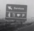
Perhaps the most important sign is the service station equivalent of an Advance Direction Sign (ADS). This is Diagram 2919.1.
It usually comes half a mile before a service area but this can be increased if the motorway is particularly busy or if the signs would interfere with more important signs. This was based on the motorway junction signage already in use: at one mile minimal information would be given, more at half a mile.
The signs are property of the operator, and are funded by them. They can include a 'now fully open sign' - see the next section.
This sign has changed a lot over time, older examples are explored below. As of April 2012 it is usually just an assortment of brand names - up to six are permitted, plus the operator.
The operator headerboard is now displayed in the middle of the sign. The six symbols should come in the order fuel, refreshments, other, with accommodation last. Generic fuel, electric car, restaurant, coffee, and accommodation symbols from the old-style sign can be used instead, and all six spaces don't need to be filled. The same brand shouldn't be used twice.
This sign design was trialled in 2011. It was introduced to address the problem where operators were creating subsidiaries with names like "Costa BK M&S" to allow them to promote themselves. Operators were very keen on the revised sign, and rolled it out almost nationwide immediately.
Rest areas still have a similar sign, but without the operator's headboard.
Further Changes
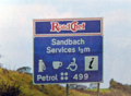
In January 2020, two modified installations of this sign were permitted. These would be placed either side of Frankley services, and would now display four symbols plus the current price of petrol and diesel. It's not clear who initiated the change, or whether this is going to become the new standard.
The revision effectively reintroduces a feature of the 1982-2012 sign which had been totally left out of the new one, although it now displays two fuel prices instead of one.
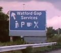
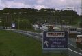
Northern Ireland

In Northern Ireland, a combination of both the old and the new Diagram 2919.1 are used. The first sign is of the new design, with the six brand logos. The second is the old design, with a few symbols and an electronic board to display the price of both unleaded and diesel fuel. This is demonstrated on the right.
Diverge Sign

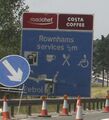
At the start of the exit for the services comes 2920.1, also known as the 'slip road sign'. This sign simply states the name of the services, with an arrow and the operator's header board. Since April 2012, the operator's logo has again been moved to the centre of the sign, with no other brands included.
Some Moto services like to say "Services Frankley", rather than the more logical way around. That's some sort of oddity which arose when a particular batch of Granada signs were manufactured and is not permitted.
These signs are also property of the operator. They are there primarily to reassure drivers that the next exit is a service area.
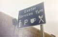
In the example photo is a sign saying 'now fully open'. These used to be written in black-on-yellow and displayed next to signs for services which had been under significant refurbishment. They are supposed to be removed after six months, but almost never are. It's not clear if they are still allowed.
In Northern Ireland, the old style of sign (like the one pictured) is used for all installations.
Supporting Signage
Exit Sign


For years Diagram 2921 was used at the exit into services, which says services with a left-pointing chevron. The problem is that the chevron implies the exit is at or nearly at a right angle, which isn't usually the case. The top photo shows the chevron (and the problem with it, since the sliproad clearly runs in a straight line) and the bottom one shows the newer alternative.
Since 2002 Diagram 2921.1 has an arrow pointing to the top-left, like similar signs usually found at a junction (those are Diagram 2910).
If the services are at a junction, then the legend 'Services' may be added to the usual exit sign, and to any other direction signs, provided this would lead to an overload of information. These are Highways England's property and shouldn't include any advertising or facilities information.
Continuity Signing

Where services aren't immediately accessible from the road, the legend 'Services' on a blue patch should be used to direct traffic to the right place.
End of Motorway Regulations

Before the start and end of motorway symbols were introduced, motorway would end with a sign saying "end of motorway". Although this was initially used at services, a separate "end of motorway regulations" was later created. Its purpose is to cancel the 'no stopping' order which had been given at the start of the motorway.
Start and end of motorway signs now use symbols rather than text, but even so the "end of motorway regulations" sign survives and is supposed to still be used at the entrance to online services - although often the similar symbol is installed instead.
Other Signs
Tiredness Can Kill

This is an optional sign reading 'Tiredness Can Kill/Take a Break'. In the 1990s the Highways Agency placed them along roads where there is likely to be a high number of fatigue-related accidents. They are always placed two miles before a service area to remind drivers to take a break without leading to large numbers stopping inappropriate places, except for one sign on the M5 which is there as the road is particularly dull.
Contrary to popular belief, they are put up by and maintained by Highways England, who normally choose the locations for them too. In the early 2000s some operators paid to have signs installed next to their services. No study has been done into whether they get more people to stop or reduce accidents.
Although no new installations of this sign have been put up, some have been replaced. They don't appear to be in the Traffic Signs and General Directions (TSRGD).
Services Open As Usual
In local roadworks, it is common to use "businesses open as usual" to try to prevent passing trade from being deterred from stopping. On the motorway, this is often varied to "services open as usual", even if it's not particularly causing confusion.
Fuel Prices

In October 2013, the Department for Transport announced as part their policies aiming to make life easier for motorists a new sign which would compare the prices at upcoming service stations. The introduced sign (right) was slightly different to the original.
The trial, running from August 2015 to 2017 on the M5 southbound between J17 and J30, allowed signs comparing petrol and diesel prices at up to three services.
After the signs were removed, the trial was quickly forgotten. Many users of the M5 had commented that the new signs simply advised that all service stations were selling fuel for the same price. In January 2020, a similar layout was used on two new experimental signs at Frankley, which would provide fuel prices at Frankley only.
Older Signs
The Diagram 2919.1 discussed above has changed many times.
The first example shows the original prototype of Diagram 2919.1; a grey-on-yellow version was considered to have it stand out, as was a diagram having the exit loop back round. Motorway Services Ltd wanted to see the signs hung from bridges. On another early drawing, the cup was given a saucer, the fork was used without the knife, a tear drop was used to show petrol stations, and amazingly it was considered using a wine glass to symbolise a restaurant.
It was decided not to use the map. Those symbols were going to be in their own rectangles, but those rectangles were taken out to keep it tidy. The parking square was going to have a red background to have it stand out. The service area name was later added to the sign; the one at Strensham hung on until 1993. The Diverge Sign had an arrow, the Approach Sign was exactly the same but without an arrow.
Anderson signs like the second example were phased out in the 1960s, and Worboys signs were introduced. These had only minor changes for service areas, to keep the signs in line with the rest of the new motorway signs. As before, an arrow was added for the Diverge Sign only.
The Prior Report of 1978 suggested that motorway service areas should have to share their fuel prices. Operators said they would only do this if they could promote their name. This led to one of the fifth example. The petrol price used to be updated manually until the 2000s, when it started to be covered up or omitted. The operator's logo should be adjusted to match the width of the sign and to be no more than three times the height of the capital letters on the sign.
The disabled symbol was dropped in 2010 and was supposed to be replaced by a picnic area symbol. Extra symbols could be added to show a restaurant, hotel and LPG. The few symbol was reviewed in 1994.
When these signs started to be removed in 2012, many of them were original installations (dating back to 1982 or since). Some of them had been patched many times, with new symbols, new operator names, new fuel prices and even new service area names, but they were usually same 1980s sign underneath. These signs are now required to be removed by January 2022.
The Diverge Sign was also revised in 1982, with the symbols being removed and operator headerboard being added. Some signs had the wording the wrong way round, reading "Services Hilton Park", but this was an error. These signs were also replaced in April 2012, with a new version that has the operator logo in the middle of the sign. This is except in Northern Ireland, where the 1982 version is still being installed.
-
 The prototype services sign. Rendered from a rough sketch.
 -
 The original Diverge Sign; the advance one had no arrow. It was part of a set of signs known as Anderson.
 -
 A later example of a Diverge Sign, part of the Worboys motorway signs, most of which are still used today.
 -
 Another Worboys sign; this is the Approach Sign. The photo was taken in 1983 so it was probably about to be replaced with the updated sign.
 -
 Significant changes were made to the Approach Sign in 1982.
 -
 The Diverge Sign with the headerboard added, pictured in 1986. This logo was made slightly too small by error.
 -
 A patched Approach Sign, pictured in 2007, with slightly changed symbols and an example of the advertising creep.


